
From confusing menus to outdated visuals, the OEBS website needed a reset. I focused on clarity, accessibility, and ease of use — building a site that supports both the community and the birds it protects.
Figma
Branding
October 1, 2024
.png)
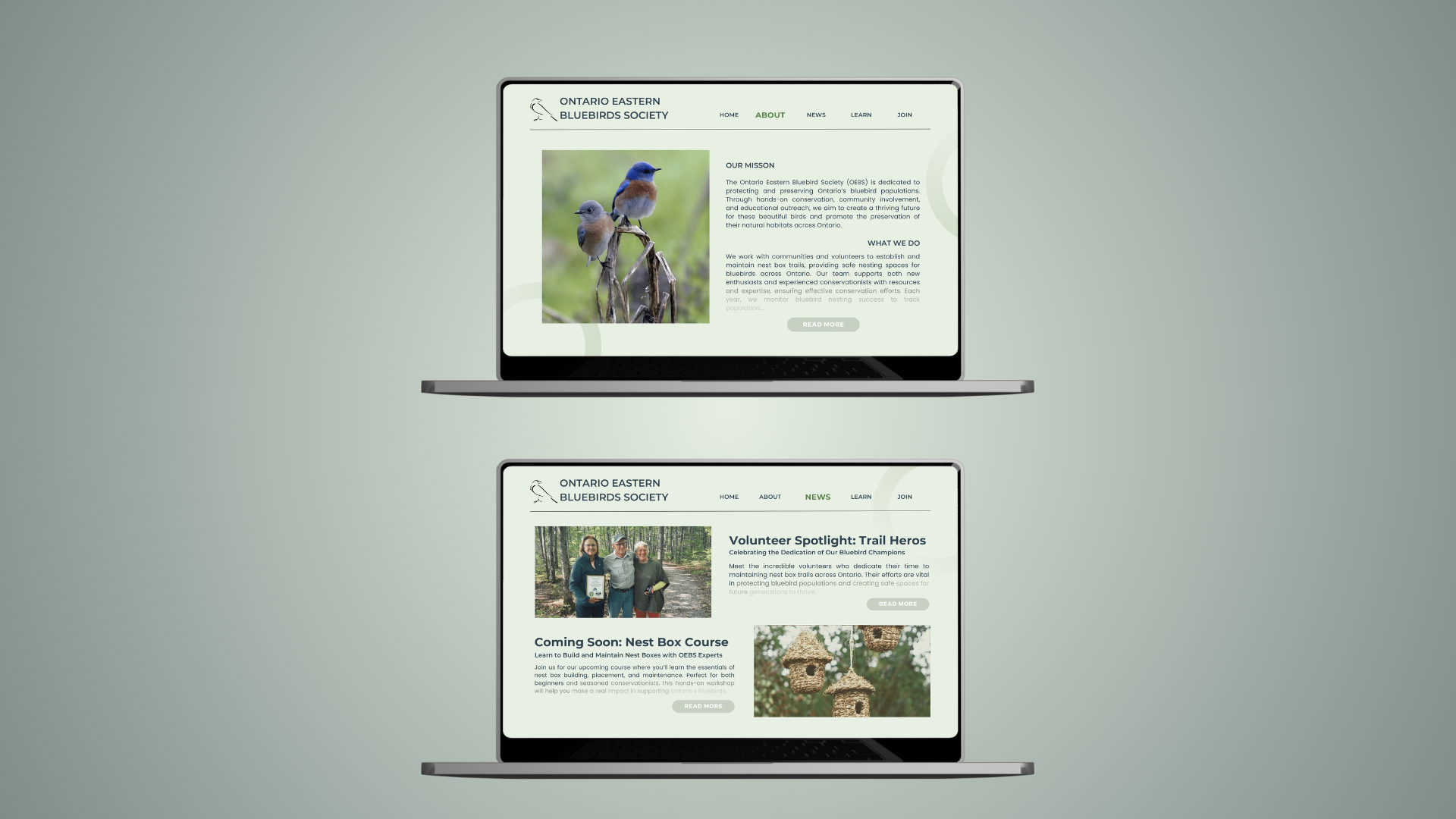
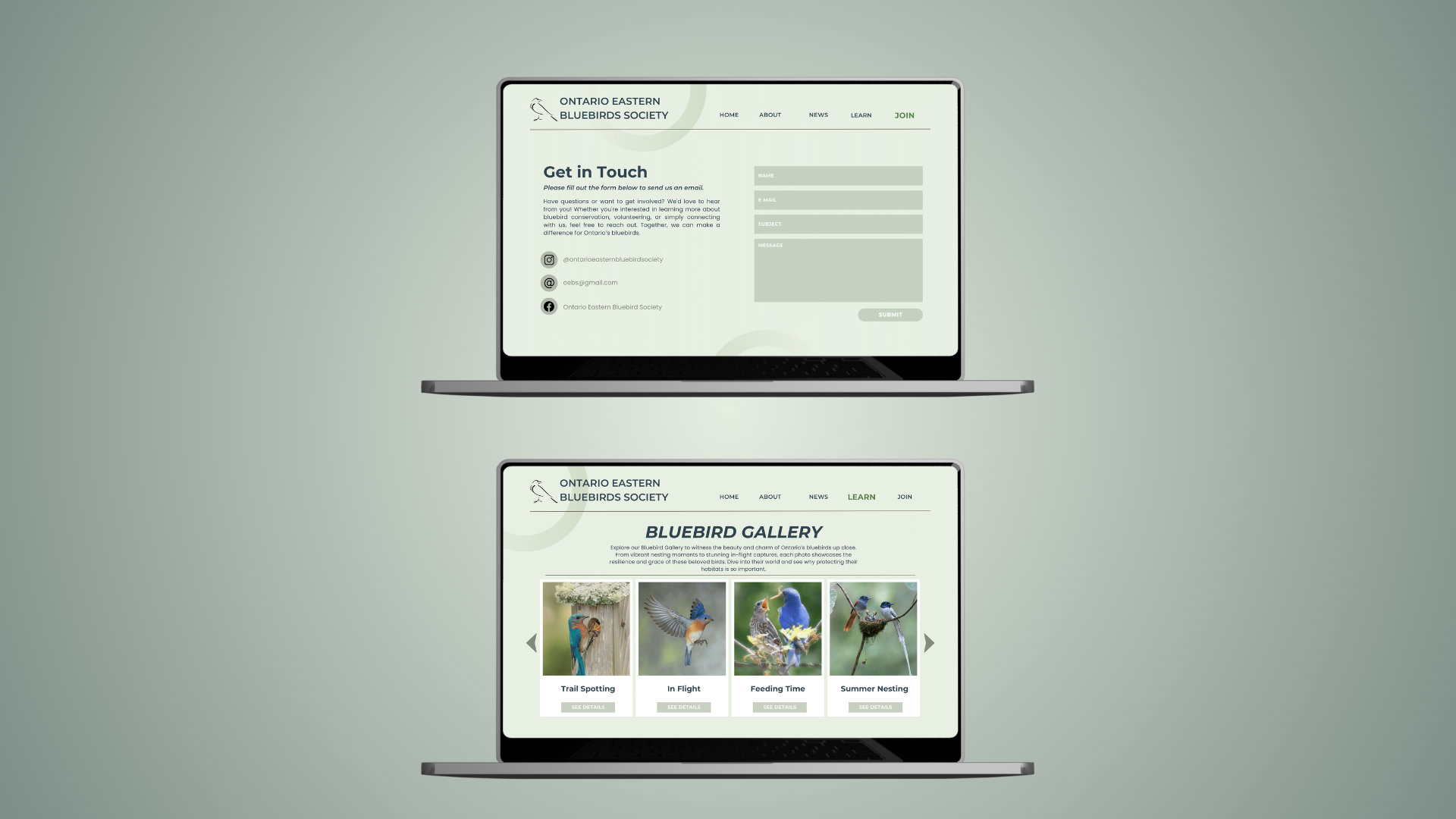
The Ontario Eastern Bluebird Society’s website wasn’t just outdated — it was quiet, cluttered, and collapsing under its own weight. I redesigned it from the ground up, not to decorate it, but to restore its voice. Every element — color, space, type — was rebuilt to feel intentional and alive. Now, the site breathes. It guides. It moves with purpose, inviting users into something they can feel. This wasn’t just a refresh — it was a resurrection.
1. Craft a Visual System That Feels Like Flight:
A soft but striking palette inspired by nature’s gradients and sharp, structured typography gave the site the calm confidence it always needed — grounded and graceful.
2. Design for Clarity, Not Clutter:
I stripped away noise and rebuilt content architecture from instinct — leading users through bold hierarchy, clean lines, and moments of stillness that hold their attention without begging for it.
2. Turn Passive Visitors into Active Believers:
Calls to action like “Protect. Conserve. Grow.” aren't just words — they’re rhythm. They spark motion. And with every page, the user is drawn closer to the mission without even realizing it.
This wasn’t just a redesign — it was a rebuild with intention. The old site lacked structure, emotion, and clarity. I stripped it down and started fresh, designing something that finally feels aligned with the purpose behind it.
Now, everything has a place. The flow makes sense, the visuals carry meaning, and the content speaks without getting lost. It’s a website built to guide, inform, and make people care — the way it always should have.
.png)
Thanks for stopping by — let’s create something unforgettable.
© 2024 Iba Abbasi. All Rights Reserved.
Built By
Iba Abbasi